
The Little-Known Fix For Your Costly Email Sign-Up Page
You built your email sign-up page carefully. A clear headline, a decent offer, maybe even a few hours spent getting the wording right. Then you watched the numbers and wondered why almost nobody filled in the box.
I spent twenty-five years as a Chartered Mechanical Engineer before I ever wrote a line of marketing copy. There is one principle from that career I still lean on more than anything I have picked up since. Every extra component you add to a system is another point where it can fail. A hydraulic circuit with three valves is more reliable than one with six, provided all three are doing real work. Most sign-up pages I come across are built like a system with twice the valves it needs.
If you are trying to build an online business after years in a corporate career, your email list is probably the single asset that matters most right now. It is worth five minutes working out whether your own sign-up page is quietly working against you.
The Hidden Cost Of One More Link
An email sign-up page has one job. Get the visitor to type their address into the box and click once. That is the entire function of the page.
A lot of pages ask for more than that without meaning to. A link back to the homepage. A row of social icons in the footer. A second offer sitting just below the first one. None of this looks dangerous on its own.
Put them all on the same page and you have handed your visitor a small decision to make before they can make the one decision you actually wanted.
Psychologists call this the paradox of choice. Give someone more options and they often choose none of them at all. A visitor who arrived with one question in mind, should I sign up for this, suddenly has three or four questions to answer instead. Most people will not stay long enough to answer all of them. They just close the tab, and you will likely never know why.
What An Engineer Would Strip Out First
In subsea systems, the rule was simple. Anything that was not load-bearing got removed before the design review, not after.
Your sign-up page should work the same way: if a link is not load-bearing, it comes off before you publish.
Nobody waited to find out whether the extra bracket would cause a problem somewhere down the line. It almost always did eventually, so it came out early, while it was still cheap to remove.
Treat your email sign-up page the same way. Open it in a new tab and count every single thing a visitor could click. The menu bar. The logo, if it links anywhere. Any button beyond the one you actually want pressed.
Ask one honest question of each item. Does this help someone sign up, or does it give them a reason to leave instead. Anything that fails that test comes off the page now, not later.
One Door, Not Five
Picture two versions of the same free guide. The first has a sign-up box, a link to a paid course, a row of social icons and a full menu across the top. The second has a headline, one line of benefit, an email box and a button that says exactly what happens next.
Same offer, same wording, a completely different result, because the second version leaves the visitor with one decision instead of four.
I have made this exact mistake myself while building the infrastructure for my own business this past year. It is an easy one to fall into when you are doing everything solo and keep thinking of one more thing to add. I have touched on this in other articles I have shared recently, and it rarely helps the page do its actual job.
To be very clear, this is not about making your page look bare or amateurish. It is about making the next step obvious, so the visitor’s attention only has one place left to go.
The One-Line Promise That Removes The Fear
Even a stripped-back page benefits from one more sentence. Under your button, add a plain line telling the visitor exactly what happens next. Something like: their guide will land in their inbox within a few minutes, and nothing else.
That single sentence quietly answers a worry most visitors never say out loud. They expect that handing over an email address leads to being bombarded with offers they never asked for. A clear promise removes that worry before it has the chance to stop them signing up at all.
Building This Without A Developer
I use eShowcase for exactly this, hosting, sign-up pages and the follow-up emails all sitting inside one system. It means I can strip a page back to one headline, one box and one button in a few minutes, without touching a line of code or waiting on anyone else.
You do not need that particular platform to apply the fix. You need five minutes and a willingness to remove anything on your page that is not doing the one job it exists to do.
A good email sign-up page does not need to be clever. It needs to be clear, which is a different and far more useful quality.
Why This Matters More When You Are Starting Later
If you spent years inside a large organisation before this, you probably never had to build a sign-up page from scratch. Someone else owned that part of the business. Now it is you, your laptop, and a form builder, and every extra feature looks tempting the first time you open it.
Resist that. The people most likely to become masters of their own destiny through an online business are usually the ones who learn to say no. They say no to the extra link, the extra icon, the extra offer, long before they say yes to anything else.
A Five-Minute Check Worth Running Today
Open your current sign-up page. Count every clickable thing on it: buttons, links, icons, menu items. Write the number down.
Ask the same question of each one. Does it help someone sign up, or does it give them a reason to leave instead.
Anything that fails that test gets removed, or pushed well below the button. Run the same check again in three months. Pages quietly collect new links over time, and every one you add makes the main job harder than it needs to be.
None of this makes your page prettier. It makes it work. That matters more if you are rebuilding a career later in life, with less room to waste on a page that is fighting itself.
Give your visitor one door. Most of them will walk through it.
I hope you found this useful
Mark
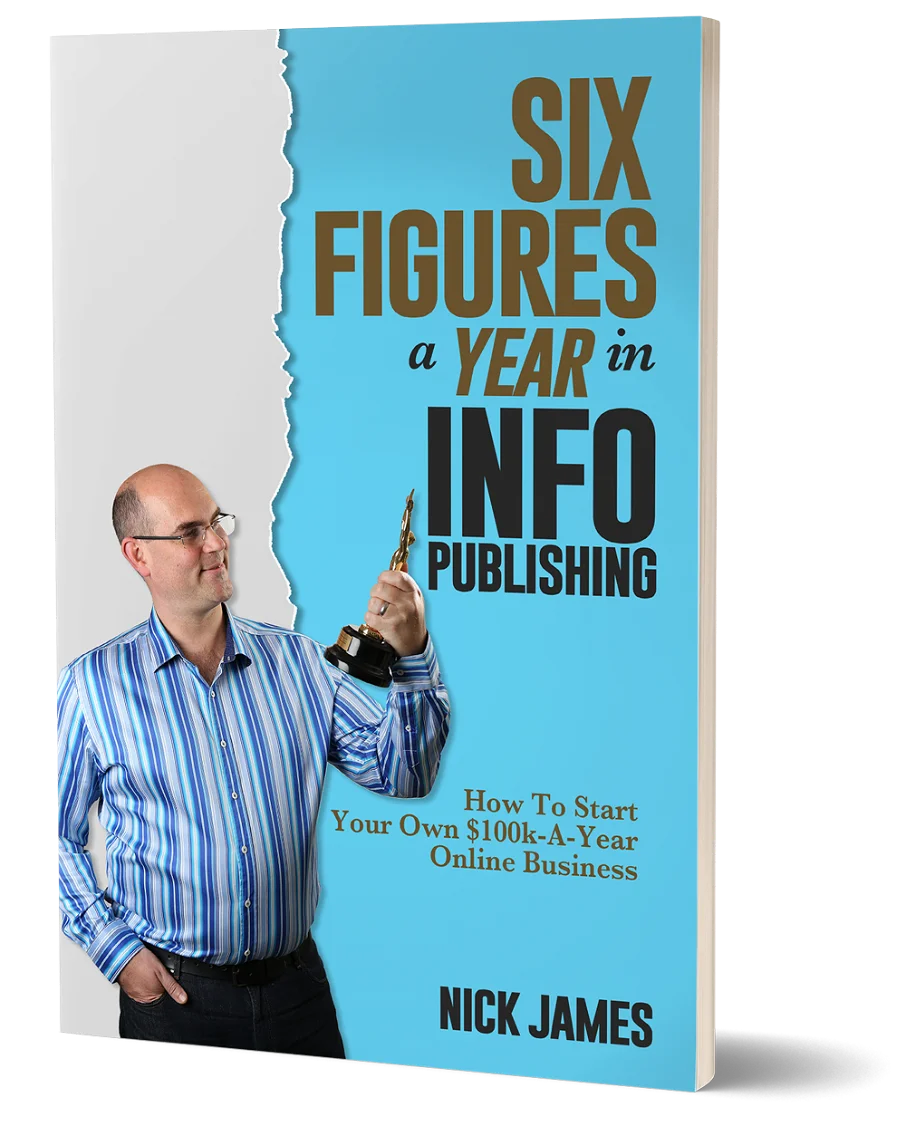
Author offers a FREE copy of this book to his next door neighbor... to prove he's not a drug dealer!
Now claim your FREE COPY.
and follow the step-by-step instructions for making the kind of money (and living the kind of lifestyle) that'll get your neighbors curtains twitching with curiosity!
Enter your details below to discover how to claim your FREE COPY of 'Six Figures A Year In Info Publishing' ...
Privacy Policy : We value your privacy. You can unsubscribe from receiving future emails with 1 click at any time.